import warnings
import matplotlib.pyplot as plt
import numpy as np
import plotly.graph_objs as go
import plotly.io as pio
import seaborn as sns
from sktime.classification.interval_based import TimeSeriesForestClassifier
from sklearn.metrics import confusion_matrix
from tslearn.datasets import CachedDatasets
pio.renderers.default = (
"notebook" # set the default plotly renderer to "notebook" (necessary for quarto to render the plots)
)
warnings.filterwarnings("once")13 Time Series Classification
Time series classification belongs to the class of supervised learning and is defined as the task of assigning a label to a time series.
Again, this is a very active research area and many different methods have been proposed. For a good overview, check e.g. Faouzi (2024), which divides time series classification methods into the following categories:
- Metric: Distance-based methods, e.g. nearest neighbor classifiers with different distance measures.
- Kernels: Methods that use kernel functions to measure similarity between time series.
- Shapelets: Methods that learn discriminative subsequences (shapelets).
- Tree-based: Methods that use decision trees or random forests.
- Bag-of-Words: Methods that represent time series as a “bag of words”.
- Image: Methods that treat time series as images.
- Deep Learning: Methods that use deep learning architectures.
- Random Convolutions: Methods that use random convolutional filters.
- Ensemble: Methods that combine multiple classifiers for improved performance.
We can see that many of these categories already appeared in Section 12.1.
A simple metric-based (distance-based) baseline method for time series classification is to use a nearest neighbor classifier with a suitable distance measure for time series, e.g. dynamic time warping (DTW). This is implemented in sktime as KNeighborsTimeSeriesClassifier or KNeighborsTimeSeriesClassifierTslearn (the latter is just a wrapper for the implementation in tslearn). These classifiers work similar to the KNeighborsClassifier for tabular data from sklearn, but use a distance measure suitable for time series. We have learned about euclidean distance and DTW in Section 12.2.
In this section we will have a brief look at time series forests (tree-based) in the context of time series classification.
13.1 Time Series Forests
A time series forest is an ensemble of time series decision trees. Each decision tree is built using a random set of intervals from the time series.
For each interval, summary statistics (mean, standard deviation, slope) are computed and used as features for the decision tree.
The final prediction is made by aggregating the predictions of all trees in ensemble (e.g. by majority vote for classification).
Here is a simple example showing the feature extraction of three time series:
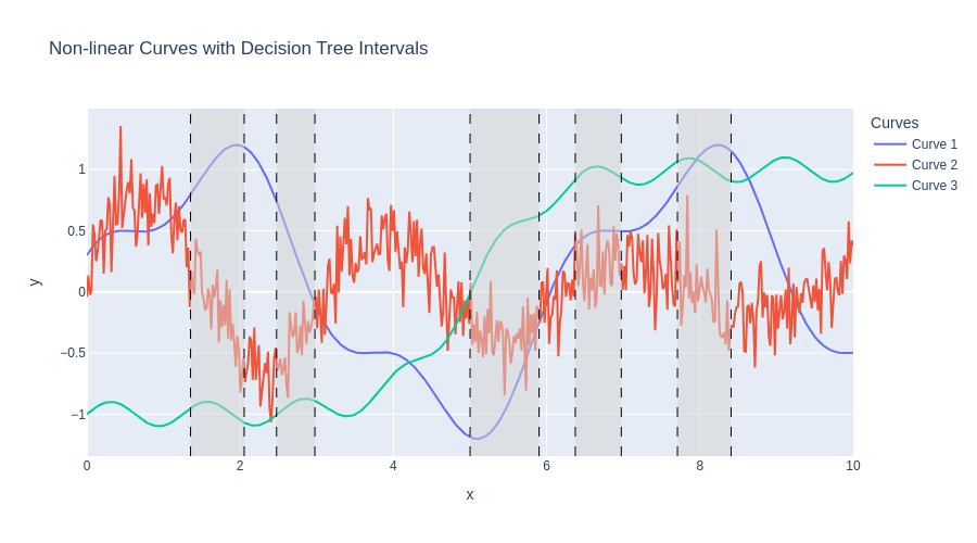
| Interval | Curve | Mean | Std | Slope |
|---|---|---|---|---|
| Interval 1 | Curve 1 | 1.07 | 0.13 | 0.61 |
| Curve 2 | -0.14 | 0.30 | -1.17 | |
| Curve 3 | -0.95 | 0.05 | -0.22 | |
| Interval 2 | Curve 1 | 0.31 | 0.25 | -1.72 |
| Curve 2 | -0.41 | 0.21 | 1.02 | |
| Curve 3 | -0.91 | 0.04 | 0.25 | |
| Interval 3 | Curve 1 | -0.89 | 0.30 | 1.11 |
| Curve 2 | -0.35 | 0.19 | -0.04 | |
| Curve 3 | 0.43 | 0.18 | 0.65 | |
| Interval 4 | Curve 1 | 0.48 | 0.03 | 0.15 |
| Curve 2 | 0.20 | 0.21 | 0.28 | |
| Curve 3 | 0.99 | 0.03 | -0.01 |
TimeSeriesForestClassifier as implemented in sktime in particular uses 200 trees (n_estimators) by default and samples sqrt(m) intervals per tree, where m is the length of the time series.
More configurable tree based ensembles are provided with ComposableTimeSeriesForestClassifier.
13.1.1 Example
We will use the same dataset as in the clustering example from Section 12.3, the Trace dataset.
13.1.1.1 Imports
Helper function for plotting
Code
def plot_clusters(X, y, title):
colors = ["#A6CEE3", "#B2DF8A", "#FDBF6F", "#CAB2D6"] # pastel, colorblind-friendly
fig = go.Figure()
X_tmp = X[:, :, np.newaxis]
for cluster_idx, cluster in enumerate(sorted(set(y))):
idx = np.where(y == cluster)[0]
show_legend = True # Only show legend for the first trace of each cluster
for i in idx:
fig.add_trace(
go.Scatter(
y=X_tmp[i, :, 0],
mode="lines",
line=dict(width=1, color=colors[cluster_idx]),
opacity=0.5,
name=f"Cluster {cluster_idx + 1}",
legendgroup=cluster_idx,
showlegend=show_legend,
)
)
show_legend = False
fig.update_layout(title=title, xaxis_title="Time", yaxis_title="Value", height=500)
fig.show()13.1.1.2 Loading the dataset
X_train, y_train, X_test, y_test = CachedDatasets().load_dataset("Trace")
# Fix shape for TimeSeriesForestClassifier
X_train = X_train[:, :, 0]
X_test = X_test[:, :, 0]13.1.2 Visualization
plot_clusters(X_train, y_train, "Training Set Clusters")Note: Here, the dataset already comes split into training and test set. In practice, you would want to do a proper train-test split on your own dataset.
13.1.2.1 Classifier
We set up the classifier and train on the training set \((X_{train}, y_{train})\) as follows.
clf = TimeSeriesForestClassifier(random_state=42)
clf.fit(X_train, y_train)TimeSeriesForestClassifier(random_state=42)In a Jupyter environment, please rerun this cell to show the HTML representation or trust the notebook.
On GitHub, the HTML representation is unable to render, please try loading this page with nbviewer.org.
Parameters
| min_interval | 3 | |
| n_estimators | 200 | |
| inner_series_length | None | |
| n_jobs | 1 | |
| random_state | 42 |
Having a fitted classifier model, we then predict the labels of the previously unseen test set \(X_{test}\).
y_pred = clf.predict(X_test)The following confusion matrix shows that the classifier performs extraordinarily well on this dataset, achieving an accuracy of almost 100% on the test set.
cm = confusion_matrix(y_test, y_pred)
plt.figure(figsize=(6, 5))
sns.heatmap(cm, annot=True, fmt="d", cmap="Blues")
plt.xlabel("Predicted")
plt.ylabel("True")
plt.title("Confusion Matrix")
plt.show()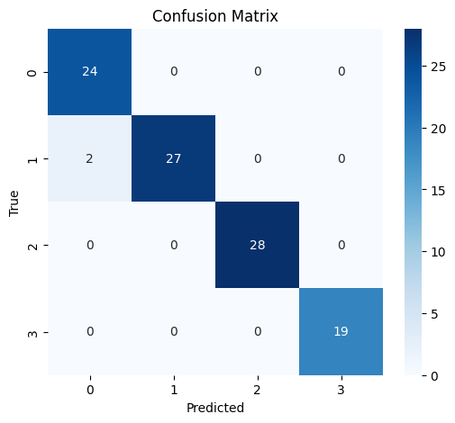
The following code plots the time series from the test set colored by their predicted label.
Code
base_colors = {1: "#0072B2", 2: "#E69F00", 3: "#009E73", 4: "#D55E00"}
fig = go.Figure()
labels = sorted(set(y_pred))
for label in labels:
idx = y_pred == label
series = X_test[idx]
n = series.shape[0]
base_color = base_colors[label]
legendgroup = f"Label {label}"
# Plot each time series with low opacity
for i in range(n):
fig.add_trace(
go.Scatter(
y=series[i],
mode="lines",
line=dict(color=base_color),
opacity=0.2,
showlegend=(i == 0), # Show legend only for the first trace of each group
name=legendgroup,
legendgroup=legendgroup,
)
)
fig.update_layout(
title="Test set time series by label",
xaxis_title="Time",
yaxis_title="Value",
legend_title="Label",
width=900,
height=600,
)
fig.show()Let us also visualize the two misclassified time series:
Code
misclassified_idx = y_pred != y_test
misclassified_series = X_test[misclassified_idx]
misclassified_true = y_test[misclassified_idx]
misclassified_pred = y_pred[misclassified_idx]
fig = go.Figure()
for i in range(len(misclassified_series)):
true_label = misclassified_true[i]
pred_label = misclassified_pred[i]
fig.add_trace(
go.Scatter(
y=misclassified_series[i],
mode="lines",
line=dict(color=base_colors[true_label]),
name=f"True: {true_label}, Pred: {pred_label}",
opacity=0.7,
)
)
fig.update_layout(
title="Misclassified Test Set Time Series",
xaxis_title="Time",
yaxis_title="Value",
legend_title="True/Predicted Label",
width=900,
height=600,
)
fig.show()
# Print the indices of misclassified test samples
print("Indices of misclassified test samples:")
print(np.where(misclassified_idx)[0])Indices of misclassified test samples:
[52 75]The two misclassified time series actually belong to class 2 but were predicted class 1.